Greetings, it's nice to have you.
I'm a Senior Product Designer at Disney working on e-commerce, profile, cast-facing tools and obsessing over design tools especially our UI Kit and Pattern Library. I have a background in traditional Graphic Design but have found my way to Digital Product Design and absolutely love it. I hope you enjoy checking out my work.
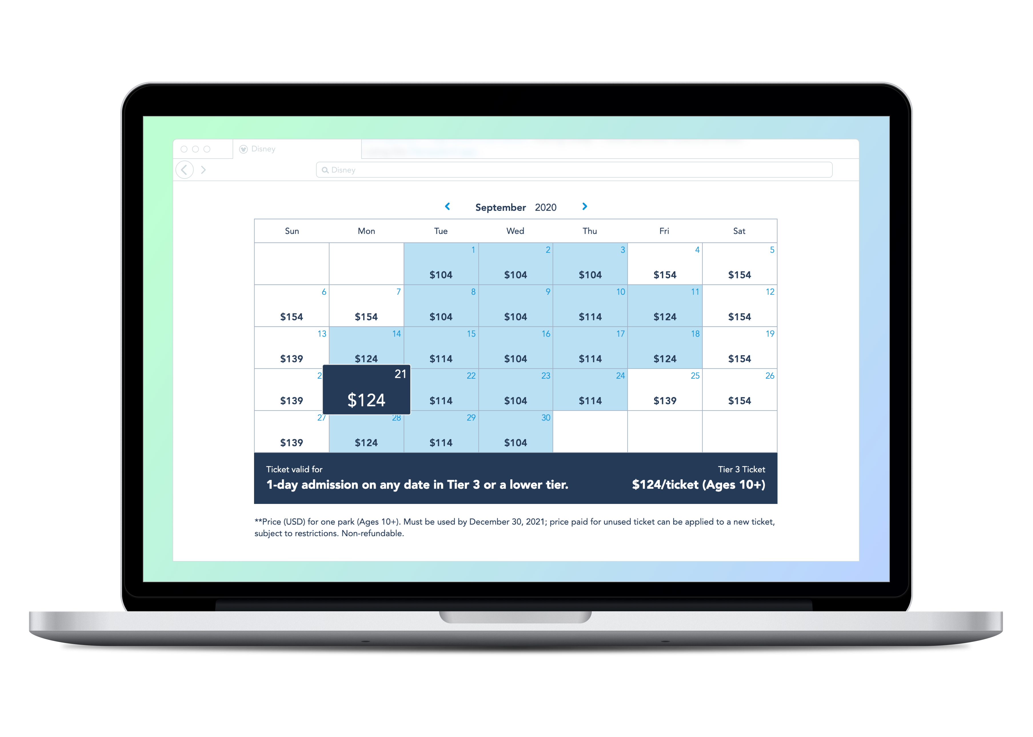
Disneyland Tickets Pricing Calendar
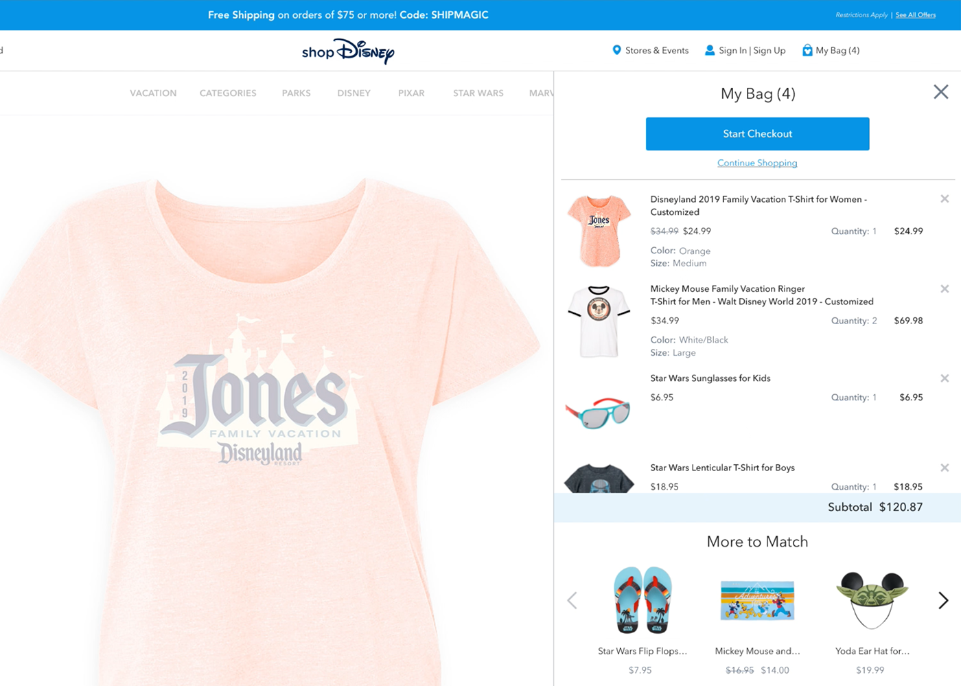
shopDisney
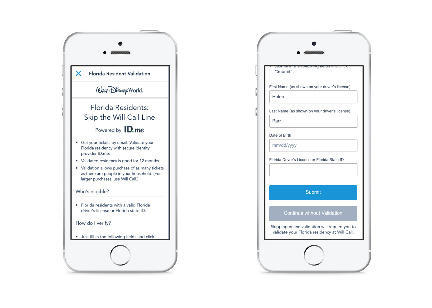
Disney Digital Validation
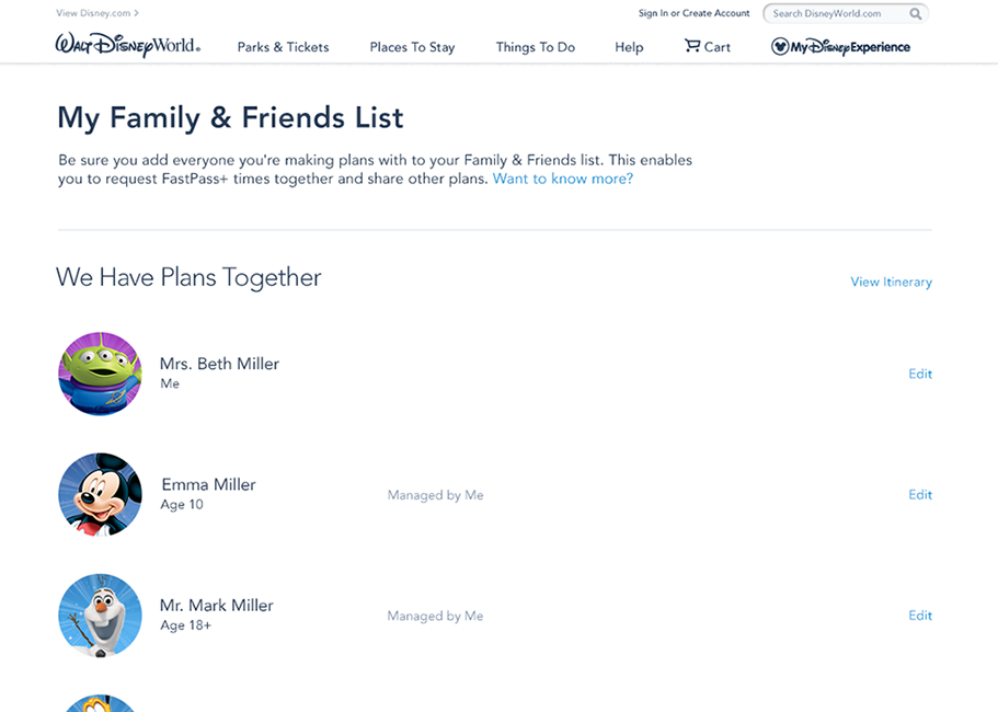
Disney World - Family & Friends